Crafting a Fragrance Commerce Experience. This e-commerce fragrance project was developed on WordPress using Elementor and WooCommerce — transforming a modern perfume brand into a fully functional online store. The goal was not only to sell products but to deliver a sensory experience through design, navigation, and brand storytelling.
User-Centered UI/UX Approach
Each page layout was designed to provide seamless browsing — from quick product previews to simplified checkout. The strategy focused on reducing clicks, increasing convenience, and giving users a smooth path from discovery to purchase.
Power of Elementor Customization
Elementor was utilized beyond basic templates by customizing sections, product grids, and interactive elements — ensuring uniqueness while maintaining a performance-optimized structure. Every detail reflects precision and brand alignment.
The sense of smell is the hair-trigger of memory.
Mary Stewart
WooCommerce was enhanced with specialized variations, fragrance categories, and dynamic filtering, helping users explore scents by preference. This ensures customers easily locate products that match their unique style and personality.
Custom Plugins for Advanced Functionality
Custom-built and third-party plugins were integrated to enhance features like wishlist, promotional badges, reviews, and cart notifications — all designed to boost engagement, conversions, and trust-building.
Search Engine & Performance Standards
The entire website architecture follows SEO-friendly practices — optimized metadata, clean code, fast loading speed, and structured pages that help the brand rank higher on search engines while providing a flawless real-time shopping experience.


A Digital Store That Smells Like Success
The result is a visually enchanting, professionally engineered perfume store that enhances brand value and customer satisfaction — defining a perfect blend of style, functionality, and business results.


“Marché” — meaning market in French — embodies the timeless charm of European street markets where culture, creativity, and community meet. The brand reflects a blend of sophistication and authenticity, drawing inspiration from the vibrant energy of French marketplaces where every stall tells a story and every interaction feels personal.
Inspiration Behind the Logo
The logo design for “Marché” was inspired by this very spirit of lively connection and effortless style. The goal was to capture the essence of a French market — elegant yet approachable, traditional yet modern. Each curve and line was crafted to express both refinement and warmth, mirroring the brand’s promise of offering quality with character.


For a brand serving professional kitchens and industrial environments, a strong and reliable identity is crucial. I crafted a modern and impactful logo for Muhammadi Steel that represents durability, innovation, and long-standing trust within the industry. The branding system was designed to align perfectly with their market — professional, efficient, and quality-driven.
The Design Process
To support their business in reaching a wider audience, I designed and developed a fully functional, responsive website that ensures seamless navigation on all devices. The user interface focuses on easy product discovery, leading customers directly to the solutions they need — from refrigeration to food processing equipment.
Showcasing Comprehensive Product Categories
The website highlights their diverse product line-up — cooking line, refrigeration solutions, dishwashing systems, commercial ovens, food processing machinery, laundry equipment, cold storage rooms, and industrial-grade racks. Each section is visually illustrated with organized product listings to enhance customer understanding and decision-making.
Building success for industrial kitchens — where performance meets perfection.
Salman Farsi
Storytelling That Builds Customer Confidence
Their long-standing market presence since 1997 is powerfully communicated through the About Us page. Supported by their own message of excellence, we crafted content that reassures customers they are working with industry experts — a brand built on reliability, performance, and client success.
Built for Conversions & Business Growth
To generate more leads and inquiries, the website features strategically placed CTAs, fast-loading product pages, and an intuitive structure that encourages customer engagement. Every design element works together to support conversion goals and build stronger business relationships.
Professional Support from Concept to Completion
Much like Muhammadi Steel supports businesses through every stage of their journey, this digital transformation was carried out with a focus on value and long-term growth. The website ensures they can efficiently communicate services, showcase new equipment, and build trust with every visitor.


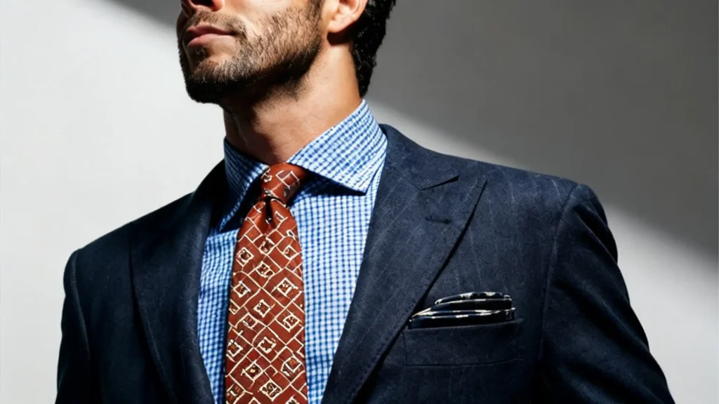
I designed and developed a visually captivating online store for a luxury fashion brand specializing in pocket squares and cufflinks. The goal was to build a platform that reflects high-end craftsmanship and elevates men's accessories into a lifestyle statement. This website doesn’t just sell products — it introduces a bold chapter in men’s style.
Brand Identity Rooted in Style and Innovation
The creative direction emphasizes elegance, individuality, and modern trends. Every design choice enhances the personality of the brand, making pocket squares and cufflinks feel not only essential but expressive. Through sleek layouts and sophisticated visuals, the brand identity becomes unforgettable and instantly recognizable.
Concept-Driven Art Direction That Tells a Story
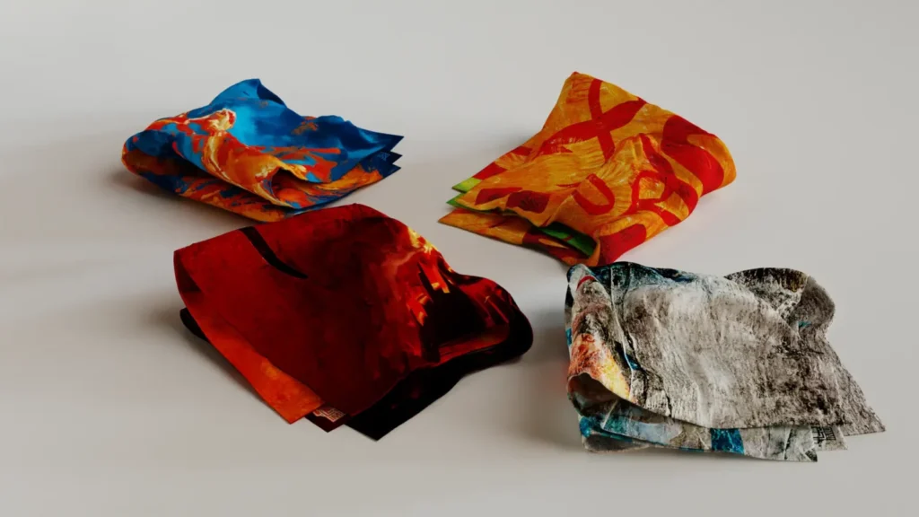
Each accessory is showcased like a work of art. Textures, patterns, and colors are celebrated through conceptual and thematic imagery, giving every product its own moment of spotlight. This storytelling approach emotionally connects style-conscious customers with accessories that complement their personal expression.
Elevating fashion online where accessories transform into stories of personal style.
Anonymous
Fashion Meets Function in Digital Design
The layout encourages effortless exploration and discovery. From featured products to style inspirations, users naturally journey through the site. Attention to detail — spacing, typography, animations — ensures that the digital experience reflects the same refinement found in the physical accessories themselves.
Built on WooCommerce for Seamless Shopping
Powerful technology supports the stylish front-end experience. With WooCommerce powering the store and Elementor enabling flexible design, the website offers fast performance, secure checkout, and smooth product management. It handles both browsing and purchases with ease, making shopping simple and enjoyable on any device.
Optimized for Growth and Better Visibility
Every page is crafted with SEO-friendly structure, mobile performance, and accessibility in mind. This helps the brand reach new audiences searching for premium accessories like designer pocket squares and unique cufflinks. Organic visibility grows as the brand builds credibility in the competitive fashion market.
Experience Visuals


A Standout Digital Presence in Men’s Lifestyle
This platform sets a new benchmark for men’s accessory brands — merging fashion excellence with smart e-commerce strategy. It’s more than a website; it’s a digital brand experience where luxury design and technology move together, creating a new standard for style in the online world.
The core concept behind the Muhammad Ali Jinnah University 2026 Table Calendar was to translate academic excellence into a visually engaging, modern design. I approached the calendar as more than a date-tracking tool—treating it as a storytelling piece that reflects student life, campus energy, and institutional pride. Every layout was designed to feel inspiring, fresh, and purposeful.
Understanding the University Identity
Following MAJU’s official style guidelines was a critical foundation of this project. Colors, typography, spacing, and visual hierarchy were carefully aligned with the university’s branding to maintain consistency and credibility. This ensured the calendar felt authentic to the institution while still allowing room for creative expression.
Student-Centric Design Approach
Students were at the heart of every design decision. I focused on visuals that resonate with ambition, learning, and growth—capturing moments of activity, collaboration, and campus life. The imagery and layouts were intentionally dynamic, helping students emotionally connect with the calendar throughout the year.
Design becomes meaningful when it reflects purpose, people, and the future it aims to inspire.
Anonemous
Enhancing Environment & Campus Energy
The university environment played a strong role in shaping the overall aesthetic. Architectural elements, open spaces, and academic settings were subtly integrated to enhance realism and familiarity. This approach helped reflect MAJU’s vibrant campus culture while maintaining a clean and professional look.
Functional Yet Aesthetic Layouts
While visual appeal was essential, clarity and usability were equally important. Each month was structured to ensure readability, proper spacing, and balance between content and imagery. The table calendar format was optimized for everyday use without compromising on design quality.
Designing with Purpose for 2026
What truly motivated me during this project was designing something meant to represent a new academic year. 2026 symbolizes progress, fresh beginnings, and future goals for students and faculty alike. This mindset pushed me to design with optimism, relevance, and long-term visual impact in mind.


A Meaningful Collaboration
Working on this project for Muhammad Ali Jinnah University was both creatively fulfilling and professionally rewarding. It allowed me to blend branding discipline with storytelling and design strategy. The final calendar stands as a refined, thoughtful representation of education, creativity, and forward thinking.
Every software brand begins with a concept, but it becomes unforgettable when that concept is shaped into a strong digital identity. Our collaboration with this leading CRM solution provider started with understanding their mission—empowering large industries with smarter, more connected management systems. That insight became the heart of every creative decision.
Brand Strategy That Builds Trust
We crafted a brand narrative that reflects innovation, reliability, and enterprise-grade performance. From color psychology to typography choices, each visual element was designed to communicate security and intelligence—qualities essential for a company that manages critical business operations.
A Logo With Purpose and Precision
The logo is more than a mark—it is the company’s promise encoded into design. Clean lines, modern structure, and symbolic geometry come together to represent data, workflow automation, and seamless organizational control. It feels bold yet approachable, making an immediate impression of technological strength.
Don't watch the clock, l do what it does. keep going
Sam Lvenson
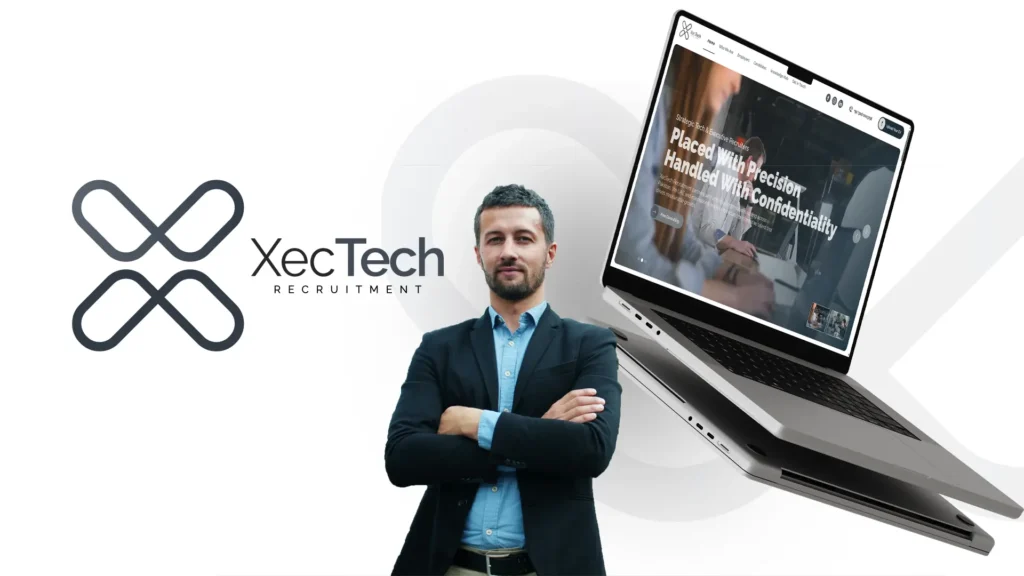
When designing the website, the top priority was clarity and ease for decision-makers. Industries don’t have time to guess where solutions are—they should instantly see value. We developed a visually elevated and strategically structured website that highlights product features, scalability, and real-world success in a clean and intuitive way.
User Experience That Guides and Inspires
Navigation flows were crafted to align with the mindset of CEOs, managers, and IT heads. From interactive product modules to frictionless contact funnels, each step helps users find their ideal path. Every click leads toward confidence—confidence in choosing a CRM platform built for big results.
Fully Responsive & Performance Optimized
Enterprise clients often access systems from various devices across many environments. That’s why this website was engineered to perform flawlessly—whether viewed on desktops at HQ or tablets on the manufacturing floor. Fast load times, smooth interactions, and optimized code enhance both reliability and user satisfaction.
Experience Visuals


Showcasing the Software With Storytelling
We beautifully showcased the CRM’s core strengths—automation, reporting, and department connectivity—through refined graphics and a narrative approach. The story wasn’t about software screens; it was about transforming how industries work, enhancing productivity, and unlocking better decisions every day.
A Partnership That Fuels Growth
This project reflects more than creativity—it reflects trust. We are proud to support a tech company that drives innovation across industries. With strong branding and a powerful digital presence, their growth journey has just begun—and we’re excited to be part of their future.