“Marché” — meaning market in French — embodies the timeless charm of European street markets where culture, creativity, and community meet. The brand reflects a blend of sophistication and authenticity, drawing inspiration from the vibrant energy of French marketplaces where every stall tells a story and every interaction feels personal.
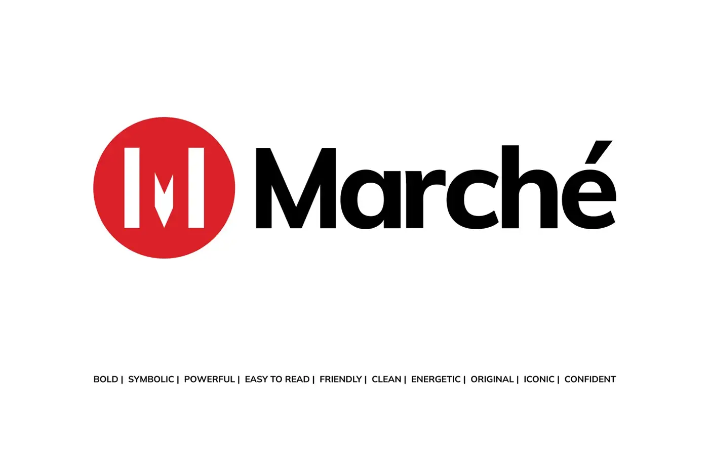
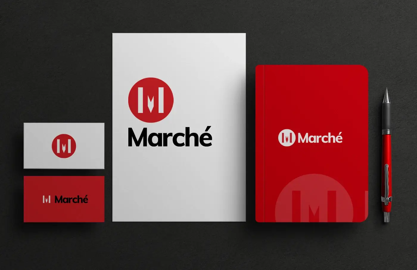
Inspiration Behind the Logo
The logo design for “Marché” was inspired by this very spirit of lively connection and effortless style. The goal was to capture the essence of a French market — elegant yet approachable, traditional yet modern. Each curve and line was crafted to express both refinement and warmth, mirroring the brand’s promise of offering quality with character.
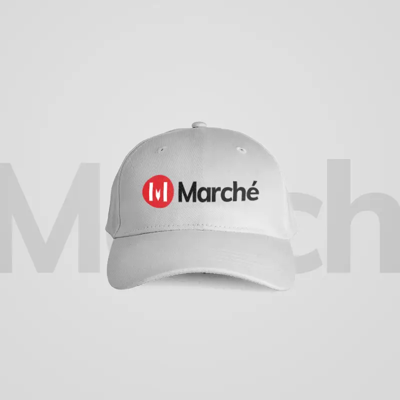
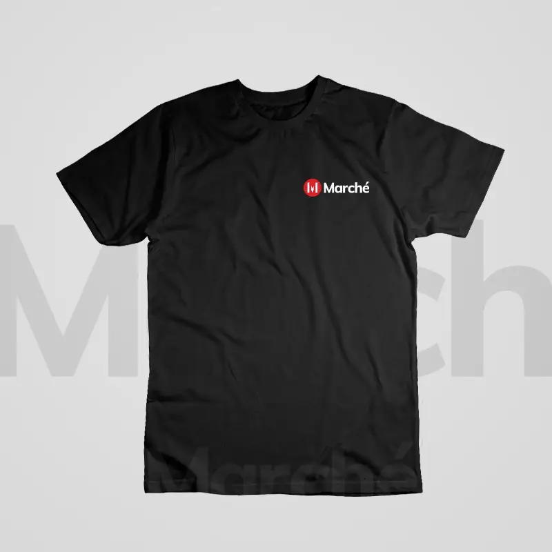
Visual Direction and Aesthetic Approach
A brand is no longer what we tell the consumer it is — it’s what consumers tell each other it is.
Scott Cook
Color Palette and Tone
A soft, neutral color palette was developed to enhance the brand’s refined identity. Earthy tones paired with a muted accent color evoke freshness and calm — reminiscent of a morning stroll through a Parisian market filled with the scent of baked bread and blooming flowers.
Brand Personality
Design Process and Refinement
The design process involved exploring several directions — from classic serif expressions to more contemporary forms — to find a balance between heritage and modernity. Through careful refinement, the final mark achieved harmony between structure and softness, representing the brand’s dual nature: grounded yet aspirational.
Experience Visuals


